
by Tracy Algar | Nov 14, 2024 | Process
The things I absolutely cannot paint without. This is a thorough list of the art supplies that I currently use for creating my paintings. None are the links are affiliate links. Let’s start with the paint I paint with South African paint for economic and...
by Tracy Algar | Jun 8, 2023 | Process
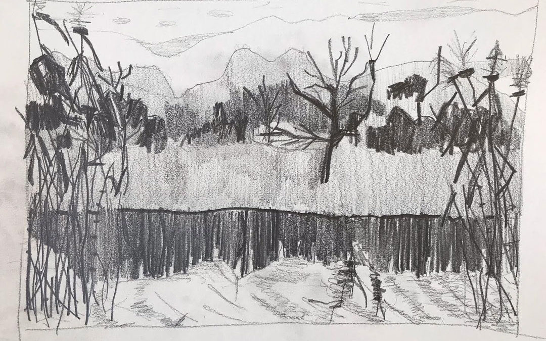
Why value studies are such an important part of my process. Value, put simply, is how light or how dark something is. It’s one of the most important elements of art, in my opinion. It took me quite some time to really understand why a value study is so...
by Tracy Algar | Feb 3, 2023 | Process
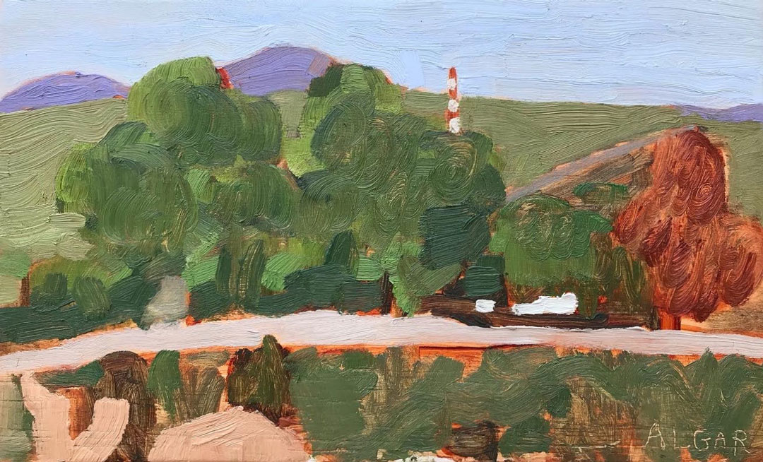
A few weeks ago on a very windy day when my friend Cathy and I went up to Stanford Hills to paint. It was a strong Southeaster and not a sheltered spot in sight (except indoors, but we didn’t want to be indoors). We decided to go down to Blue Moon Farm where...
by Tracy Algar | Jan 28, 2023 | Process
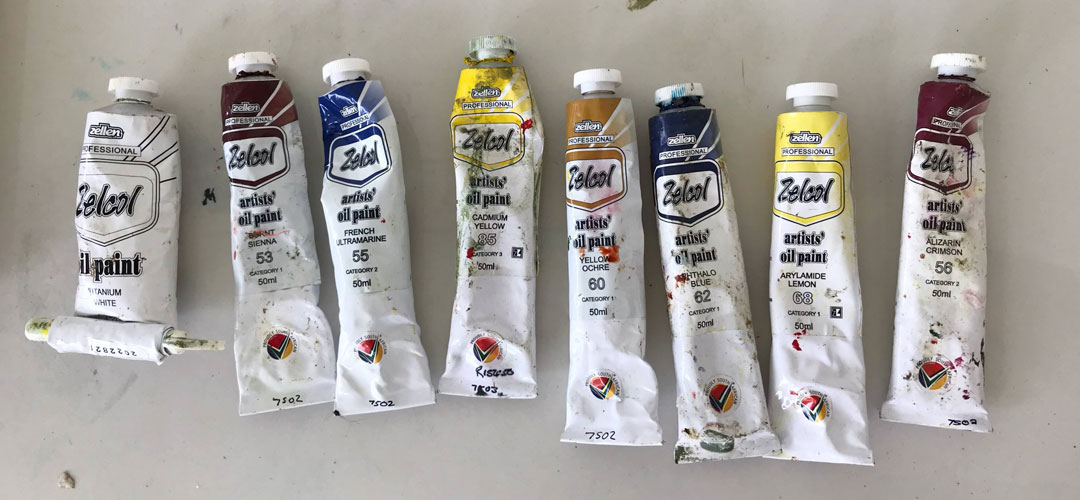
What are the reasons to use a limited palette? And what limited palette can I use for landscapes? My limited palette of Zellen artists’ oil paint. Firstly, I’m a plein air oil painter, so I don’t paint in a studio very often. I carry my studio on my back, which...