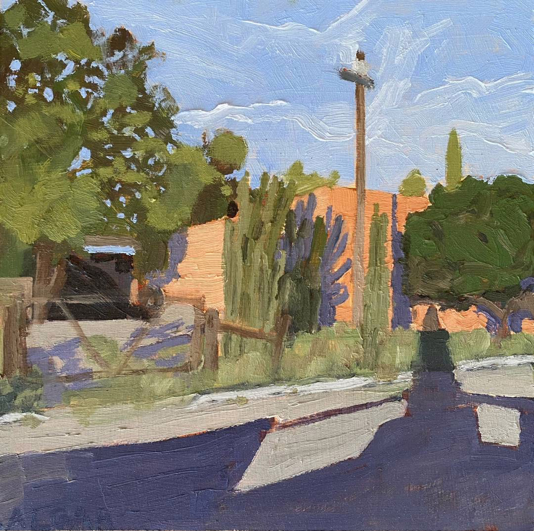
Value is the foundation of a successful painting. It refers to how light or dark a colour is, and is more important than colour itself for creating a sense of form, depth, and convincing light. Without proper values, even the most beautiful colours will be unconvincing.
Value is what creates a believable image. You can see this if you look at a black and white photograph—the values are what make it powerful. A value study is my secret weapon; it lets me focus on this one critical element before I even touch a brush.
Why I Do a Value Study
Value studies are an important step in my artistic process. They serve several key purposes:
- A Practice Run: I see them as a chance to test a composition and see if it works before I commit to a full painting. Sometimes, a quick sketch reveals that a different angle or a different crop would make for a stronger image, and it’s much easier to fix it in a sketchbook.
- A Compositional Aid: By simplifying my subject into a few distinct values, I can clearly see the big shapes and how they relate to each other. This helps me map out my painting and identify areas of light and shadow.
- Pre-planning: For me, a value study is a blueprint for the painting to come. I can work out all the tricky value relationships and compositional elements in a low-stakes environment, helping me have a more confident and efficient painting process.
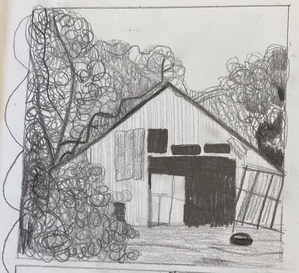

My Process, Step-by-Step
Here’s a simple guide to creating your own value studies. This method is quick, easy, and will dramatically improve your paintings.
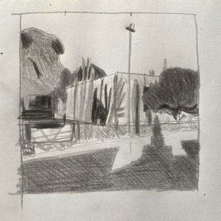
Fill in the Shapes: Using a soft graphite pencil (I prefer a 4B or 6B for its rich darks), I fill in the shapes I’ve sketched with their corresponding values. I use a consistent, light pressure for the mid-tones and build up pressure for the darks. I leave the lightest areas of my sketch as the white of the paper.
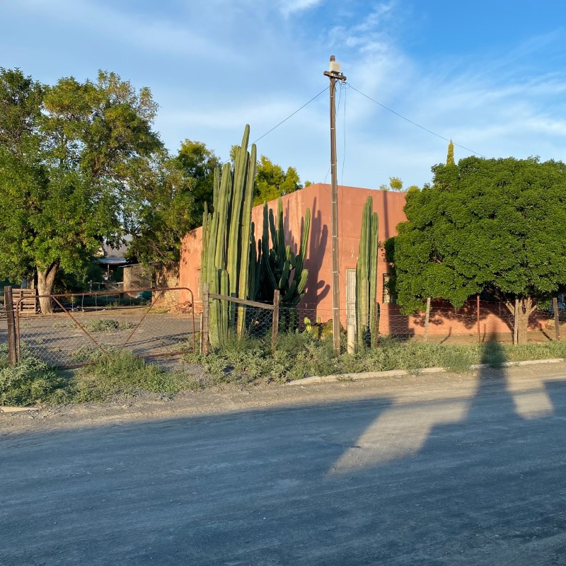
Select Your Reference: I always start by choosing a reference photo or subject. I crop the image to the composition I find most appealing. If I’m working from life, I decide on a specific view I want to capture.
Sketch the Big Shapes: In my sketchbook, I lightly sketch the large, dominant shapes of my subject. I focus on the main masses, such as the overall shape of a building, a tree, or a figure, and their placement within my composition. I don’t get bogged down in details.
Simplify and Map Out Values: This is where the magic happens. I simplify my subject into just three values: light, mid-tone, and dark. As I observe my reference, I categorize each area into one of these three values. For example, a sunlit wall is a light value, a wall in shadow is a dark value, and an area that’s neither is a mid-tone.